
The impact of colours on your brand image.
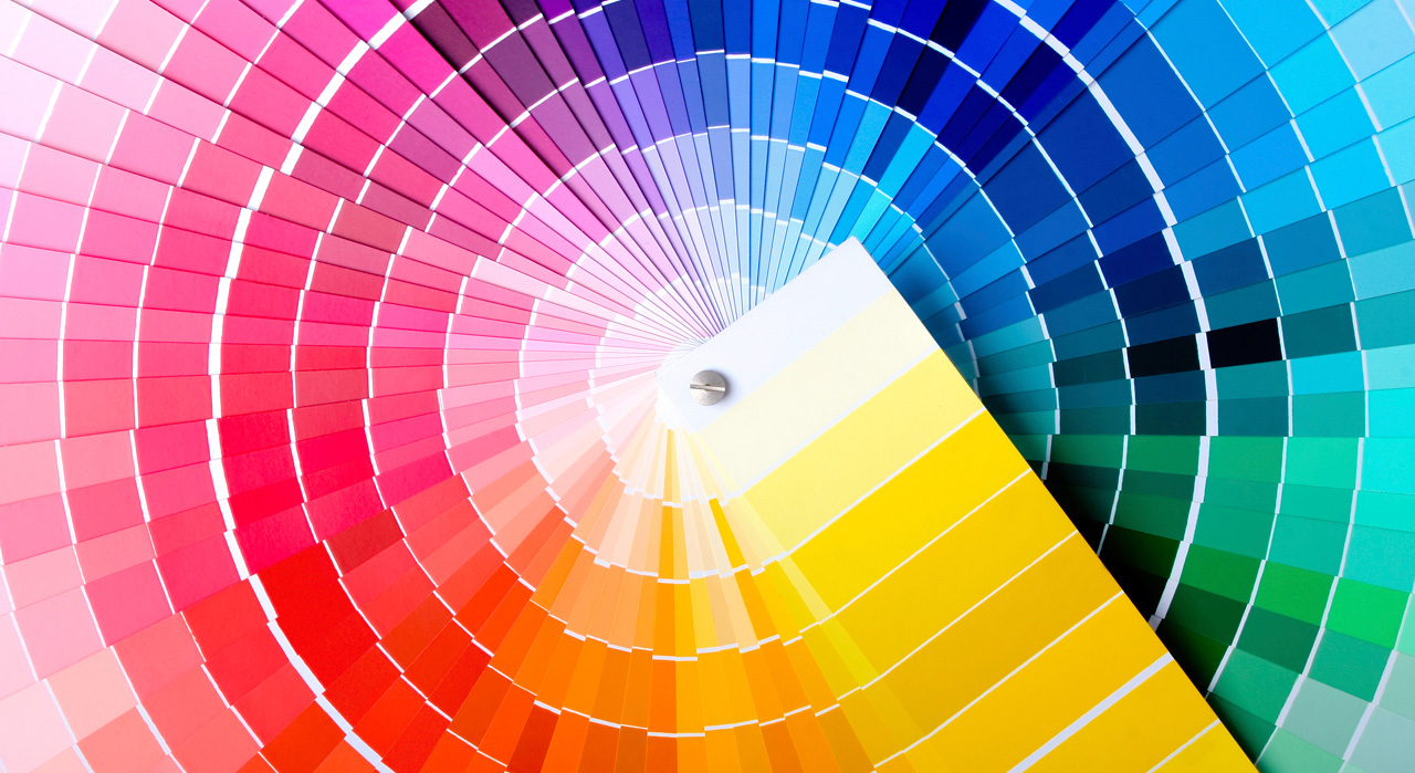
The human mind is very sensitive to visual stimuli and colours are crucial in marketing because of the emotions they trigger and the impact they create. Colours carry a message both at conscious and unconscious levels. That is why graphic designers must use the power of colours with finesse to make their designs meaningful and vibrant.
With their aesthetic properties and psychological impact, colours can transform the identity of a brand. Based on the emotions our brains associate with each colour, using them deliberately can give multiple levels of meaning to a brand image. You can use these associations to underline or emphasize your message. Your business’ logo for example will be stronger with the right colours!
The choice of the specific colours used in the promotion of your business must be consistent with its vision and the impact you want to create on your target audience. Those links between emotions and colours are not rigid rules of course, especially since the global impact of the design of your logo does not depend on colours alone. It depends on the interaction of those colours with the forms, gradients, tones and typography (text).
In fact, colours will simply amplify and emphasize the message of your organization. In general, bright and bold colours are eye catching but can become aggressive. Neutral colours convey a more sophisticated image, but they have less impact. Here are a few examples of the meanings associated with different colours:
- Red: passion, energy, danger, aggression, warmth.
Apparently it wets appetite which explains why it is used in numerous restaurants and food product logos like Coca-Cola and McDonald’s. Red is linked to desire, to passion and to power. Studies have shown that red on orange encourages you to eat and leave a restaurant faster. Notice how that combination is used in many fast food chains. In general, red has a strong impact but on the other hand, too much red can be seen as agressive.
– Areas : Luxury, fashion, eroticism, sports, media, humanitarian, wine, gastronomy. - Orange: innovation, youth, fun, affordability, accessibility.
Orange is an informal colour that represents friendliness and conveys a festives and care-free tone.
– Areas: Entertainment, sports, getting in shape, communications, the food industry. - Yellow: joy, pleasure, warm, friendly, youth, optimism, confidence.
Yellow conveys positive emotions. It should be considered to target younger consumers. It’s a colour that conveys feelings of fun and joyfulness. It is not linked to luxury or excess. Use it for its approachability.
– Areas: Tourism, children, food industry, insurance, credit, music, information. - Green: natural, ethics, growth, freshness, respect, nature, serenity.
Green brings a feeling of harmony. Use this colour if you need to increase the confidence of the public towards your brand.
– Areas: discovery, adventure, nature, travel, education, environment, ecology. - Blue: professionalism, seriousness, integrity, sincerity, authority, success.
Blue is linked to authority and success. It is popular with financial institutions and governmental organizations. Blue is also a strong colour, timeless and universal. Be careful when you use it as it tends to convey a colder and more corporate tone thus, it is more impersonal.
– Areas: corporate, aeronautics, computers, technology, environment, travel. - Violet: captivating, creative, sophisticated luxury, dignity, wealth.
Use it if you want to convey new and innovative ideas.
– Areas: Art and culture, luxury, music, education, beliefs. - Black: power, sophistication.
Black represents prestige so it is not accessible to everyone. Use it to claim your uniqueness and show that you are at the forefront of your field.
– Areas: cinema, art, photography, luxury. - White: purity, cleanliness, simplicity, innocence.
From an optical point of view, white is not a colour as it’s the synthesis or combination of all the colours on the spectrum. In practical terms, a white logo will always need a coloured area behind it to insure its visibility when used on a white surface or substrate.
– Areas : winter, marriage, fashion, news, religion. - Brown : masculinity, outdoors, terroir, recycling, nature.
With the right tone, it can be combined with almost any other colour. Use it to emphasize wisdom or voluptuousness in food related uses.
– Areas : culture, confectionery, history, nature. - Pink: fun, affection, innocence, romance.
Be careful with this colour as it can become garish very quickly and convey the opposite of the intended effect.
– Areas: childhood, femininity, leisure, confectionery, bakery, art.
Nowadays, the Internet breaks geographical barriers and opens the frontiers of information to new horizons. So we are prompted to reflect on the meaning of colours across the globe. Depending on countries, cultures and eras, colours sometimes convey diametrically opposed meanings. For example, white which is linked to purity in the west is linked to mourning in most Asian countries.
As you reflect on your brand and the colours that will support it, identifying your target audience will be crucial. It will also be important to take heed of the brand identity of your competition. Sometimes it’s preferable to align your brand with your competitors (either by typography, style or similar colours) and, other times, it’s better to stand out.
Now, all you have to do is display your true colours!!!